'}}

Beyond the canvas

Dark Mode vs. Light Mode: Which Is Better for Your Website?

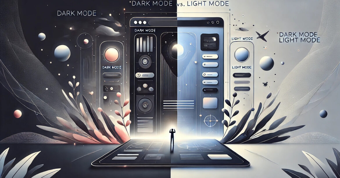
Both dark and light modes offer unique advantages and can impact a website's usability, aesthetics, and user experience.

The debate between dark and light modes has been trending for years, and for good reason. Both styles offer unique advantages and can impact your website's usability, aesthetics, and user experience. At Gossh, we're all about helping you make informed decisions about your website, so let's examine the pros, cons, and considerations of dark mode versus light mode.

What are dark mode and light mode for a website?

  • Light Mode: This is the classic design standard, with a white or light-coloured background and dark text. It's clean, familiar, and often used for its high readability.
  • Dark Mode: A modern alternative with a dark background and light-coloured text. It's sleek, easy on the eyes, and gaining popularity across apps and websites.

The case for light mode website

Pros:

  • High Readability: Light mode mimics traditional print, making it comfortable for long-form reading.
  • Familiarity: It's the default setting on most websites, so users are used to it.
  • Universal Appeal: Light mode works well across various industries, from corporate websites to e-commerce platforms.

Cons:

  • Eye Strain in Low Light: Light mode can be harsh in dim environments, potentially causing discomfort.
  • Less Modern Feel: While classic, it is less trendy than dark mode.
  • Best for: Websites with a lot of text content, such as blogs, news sites, or educational platforms.

The case for dark mode website

Pros:

  • Reduced Eye Strain: Dark mode is gentler on the eyes in low-light settings, making it ideal for late-night browsing.
  • Modern and Sleek Look: Dark mode feels innovative and stylish, often appealing to tech-savvy users.
  • Energy Efficiency: On OLED and AMOLED screens, dark mode can save battery life by requiring less power to display.

Cons:

  • Readability Challenges: Light text on a dark background can sometimes be more challenging to read, especially for long-form content.
  • Not for Every Brand: Dark mode doesn't suit every industry or brand identity, particularly those focusing on traditional or luxury aesthetics.
  • Best for: Tech, gaming, creative portfolios, and any website targeting a younger, modern audience.

Which should you choose?

The choice depends on your audience, branding, and website's purpose. Here's how to decide:

  • Know Your Audience: Dark mode may resonate more with your audience if they prefer innovation. If they value familiarity, light mode is a safer choice.
  • Consider Your Brand: Dark mode often feels bold and futuristic, while light mode aligns with clean, classic branding.
  • Blend Both: Why not offer both? A toggle option lets users switch modes, giving them control over their experience.

How Gossh can help

Gossh lets you quickly implement light and dark mode options into your website. Our customizable templates are designed to look stunning in either mode and with intuitive tools, creating a user-friendly toggle feature is a breeze.

Our final thoughts

Dark and light modes have strengths, and there's no one-size-fits-all answer. The key is aligning your choice with your audience's preferences and brand identity. Whether you go bold with dark mode, stick to the classic light mode, or offer both, Gossh is here to help you build a website that shines—day or night.

Start creating your perfect website with Gossh today!

Latest trends from around the globe: https://www.awwwards.com/

We make websites.

At Gossh, we design websites, too. We create exceptional digital experiences that will elevate your brand. Our secret? We use our powerful website builder, which the leading brands trust.